Tasker
the challenge
From the initial problem statement to the final high-fidelity prototype, I embarked on the challenging journey of creating a wellness app from scratch, setting up landing, goals, and progress pages.
Through careful planning, user research, and iterative design processes, I crafted an intuitive user interface and seamless user experience.
This case study demonstrates my ability to undertake a project from its inception, conducting user research, and delivering a comprehensive solution that addresses user needs with a user-centric approach.
Role
UX Design;
UI Design;
Discovery and Research;
User Journey;
User Persona;
Wireframes, Mid-fidelity and High-fidelity design;
Interactive Prototype
Tools
Figma, Notion, PowerPoint
Team
Individual
Timeline
2 weeks
overview
the product
Tasker is a user-friendly wellness app that helps the need for students to break down their study tasks into manageable units, and introduce the innovative concept of dividing tasks into mini tasks.
Furthermore, Tasker's progress tracking feature enables students to mark their completed mini tasks, offering a sense of accomplishment and motivation along their academic journey. The inclusion of a flexible time range view grants students the freedom to plan and organize their tasks effectively, be it on a daily, weekly, or monthly basis.
The result is a visually appealing and intuitive app that empowers students to achieve academic success by effectively organizing their study schedules.
design thinking process
knowing the users
3,7%
of the users
have negative feelings while studying
Main Feelings
Overwhelmed
Frustration
Insecurity
Main Causes
Feeling overwhelmed by too many tasks
Difficult focusing on studies
Uncertainty or not knowing how to organize their schedules
afinitty diagram & empathy map
To gain deeper insights into the primary concerns of Tasker app users, I utilized the Affinity Diagram and Empathy Map techniques. These methods helped uncover several significant findings and allowed for the development of an user persona, which will be presented afterward.
Highlights:
Students try to multitask or work on several things at once;
They may think they will never be able to manage their time effectively;
They may also feel frustrated or disappointed when they fall behind on their tasks;
Their pains include time management, prioritization, procrastination, and lack of organization;
The gains are staying organized, feeling more confident and self-assured in their abilities, and improving their professional or academic performance.
I don’t have enough time and I need to get organized.
Laura, Highschool student
KEY WORDS:
* DEADLINES * INSECURITY * STRESS * OVERWHELMED *
priorization
user persona
Samantha was working as a Graphic Designer but wasn't happy with her job. So, she decided to join Ironhack’s UX/UI Bootcamp to change her career. Although she was excited about this opportunity, she was worried about the class schedule.
The schedule was intense, similar to a full-time job with many extra activities and short deadlines for projects. However, she was determined to make the most of her time in the course.
“I'm feeling really overwhelmed with all of the assignments and deadlines. I’m afraid that I won’t have enough time to finish it with quality.”
Samantha Santos
problem statement
Samantha is a 30-year-old UX/UI student who needs to manage and organize her schedule because she is struggling with deadlines and breaking down her schedule can help het make the tasks less overwhelming.
How might we help students prioritize tasks within their schedules?
competitor analysis
In conducting a competitive analysis for Tasker, I drew inspiration from popular platforms like Headspace and Structured. These apps served as references for designing engaging onobarding screens, defining color schemes to identify different activities, and creating a fun and easy appearance.
By studying their user-friendly approaches, I aimed to incorporate effective design elements into the app, catering to the needs and preferences of both students and other users. This analysis provided valuable insights for developing an intuitive and visually appealing scheduling app that simplifies task organization and management.
After analyzing the competitors' tools, I came to the realization that there was a lack of emphasis on subtasks.
main competitors
Structured app
Headspace app
the design process
lo-fi prototype
During the design process, I prioritized refining the onboarding experience to ensure users felt confident navigating the app. Each screen was crafted to provide clear instructions and highlight key features, fostering engagement from the start.
Moving on to the personalized homepage, my goal was to create a visually appealing and user-friendly layout that allowed users to easily access their daily, weekly, and monthly calendars. The design ensured seamless transitions between calendar views, allowing users to easily switch time frames and overview their schedules.
Within the schedule tool, I focused on creating a simple and intuitive interface for users to add, edit, and manage their daily activities effectively.
In the mid-fi prototype, I made significant changes to the visualization of the weekly and monthly views in response to user feedback.
mid to high-fi
homepage
On the homepage, I made changes to the icons and displayed activities as separate projects. Additionally, the number of completed tasks is now visible.
add task
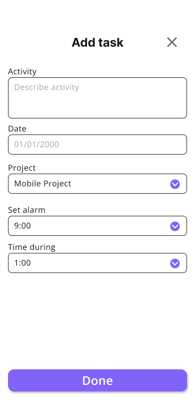
After conducting usability tests, I made the decision to focus more on the "mini tasks" and opted to separate projects from tasks. Now, users first add the project and then add the tasks within that project. Users have the ability to select the category, priority, and color for each project, allowing for better organization and customization.
daily schedule
For the daily schedule, the priority now appears as a different-colored button, allowing users to easily identify and prioritize tasks. Users can also edit and delete tasks as needed. The colors are used to differentiate between different types of projects, and the project name is displayed for better organization.
weekly schedule
For the weekly schedule, I made the decision to remove the priority indicators for activities after receiving the feedbacks. Additionally, I included the name of the project that contains activities for each day, enhancing organization and providing better context for users. Furthermore, I divided the week into shifts, specifically morning, afternoon, and night, to further enhance the organization and clarity of the weekly schedule.
monthly schedule
For the monthly view, I simplified it as much as possible. I only indicated the presence of activities on each day, as users can already view the details in the weekly and daily views.
stats
The stats page now has a separate section, displaying users' goal achievements along with encouraging messages. It is divided into daily, weekly, and monthly graphs for better visualization.
the final design
hi-fi prototype
In the final high-fi prototype of the Tasker project, I created a user flow that encompasses several key screens. The journey begins with the onboarding page, where users are introduced to the app and guided through the setup process. They have the opportunity to set their waking and sleeping hours, ensuring a personalized experience.
Upon completing the onboarding, users are directed to the empty page, which serves as a starting point for organizing their tasks. From there, they can easily add projects and tasks, ensuring a systematic approach to task management.
To track progress, users have the option to mark tasks as done, providing a sense of accomplishment. Additionally, they can access the stats page, where they can review their performance and gain insights into their task completion.
Final flow
3 extra screens
I also expanded the solution to another device by designing three additional screens for the iPad Air: the onboarding flow, the daily schedule view, and the add project page. These adaptations ensured layout consistency, improved content distribution across a larger screen, and maintained usability across devices.
key learnings & next steps
As key learnings, surveys played a crucial role in identifying and understanding the problems faced by users, offering valuable insights for improvement, while desirability testing validated and refined app features based on preferences.
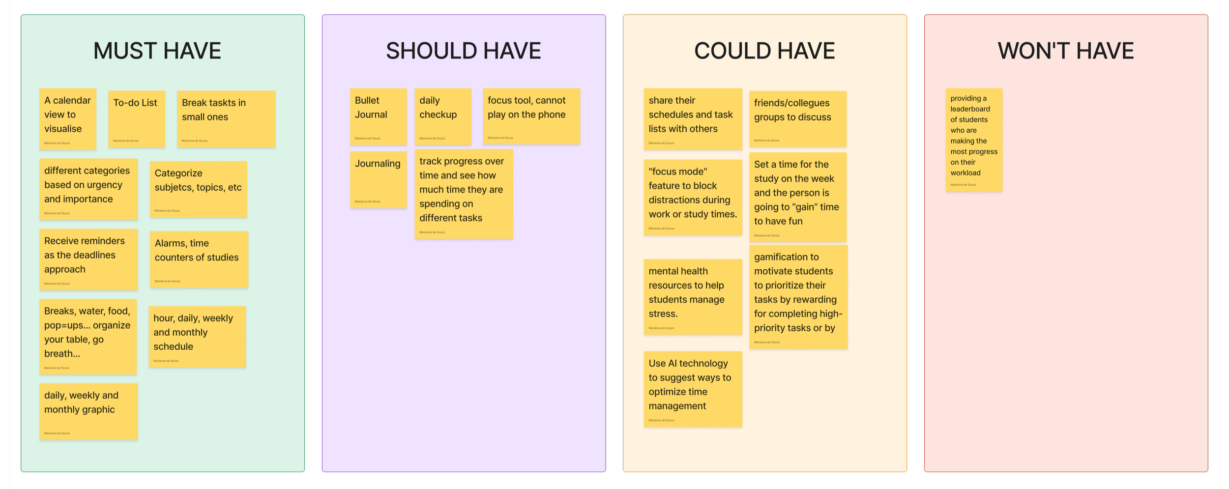
Next, I plan to implement “should have” and “could have” priorities, introduce wellness notification popups to enhance engagement, and improve the weekly calendar design. Moving forward, I will refine the prototype flow, address usability issues through thorough testing, and ensure a seamless user experience.”


